
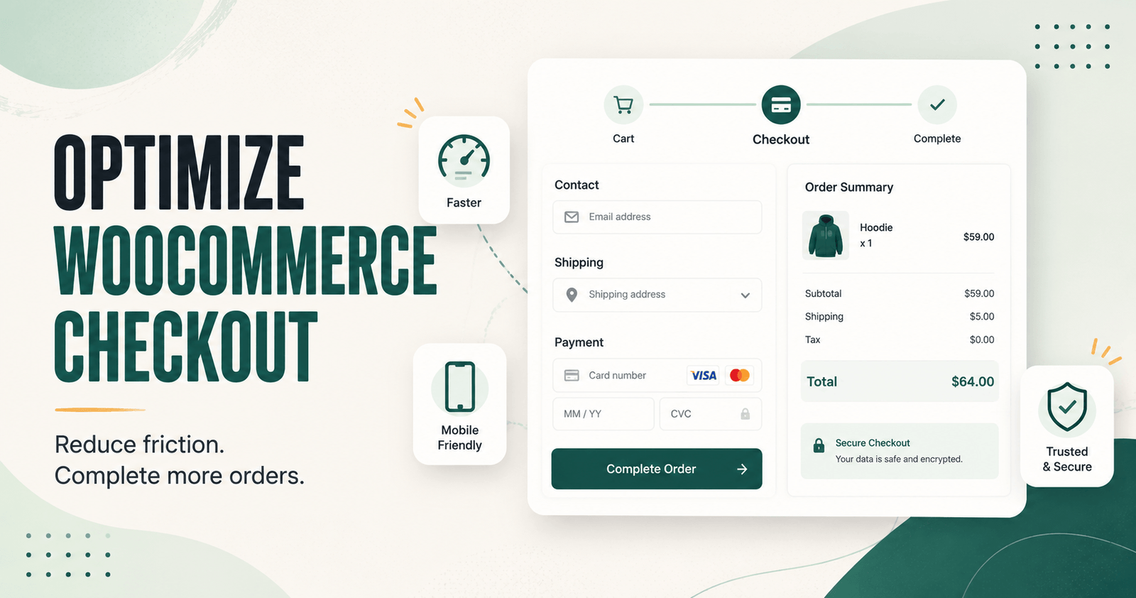
Learning how to optimize WooCommerce checkout starts with one simple principle: remove unnecessary effort without removing information the store genuinely needs.
A customer who reaches checkout has already shown strong purchase intent. They have viewed products, compared options, added an item to the cart, and decided to move forward. At this stage, confusing fields, unexpected costs, weak mobile usability, payment errors, or slow performance can still stop the order.
Checkout optimization is not about making the page shorter at any cost. It is about creating a clear, reliable path from customer details to payment confirmation.
This guide explains how to improve WooCommerce checkout for more completed orders while protecting usability, trust, compatibility, and the operational needs of your store.
Table of Contents
- What is WooCommerce checkout optimization?
- Start with a checkout audit
- 1. Allow guest checkout where appropriate
- 2. Remove unnecessary fields carefully
- 3. Show costs before the final step
- 4. Optimize checkout for mobile customers
- 5. Offer reliable payment methods
- 6. Improve validation and error messages
- 7. Keep the order summary clear
- 8. Reduce checkout distractions
- 9. Improve checkout performance
- 10. Add useful trust signals
- 11. Make forms easier to complete
- 12. Handle coupon fields carefully
- 13. Use order bumps without interrupting checkout
- WooCommerce Checkout Block vs classic checkout
- How to test checkout changes
- What to measure after optimization
- Where CartLane fits
- Common checkout optimization mistakes
- WooCommerce checkout optimization checklist
- Final thoughts
- Frequently asked questions
What Is WooCommerce Checkout Optimization?
WooCommerce checkout optimization is the process of improving the final purchasing experience so qualified customers can complete an order with less confusion, delay, and avoidable friction.
That may involve:
- Reducing unnecessary checkout fields
- Enabling guest checkout
- Making costs visible earlier
- Improving mobile usability
- Offering dependable payment options
- Clarifying validation errors
- Keeping the order summary visible
- Reducing page distractions
- Improving load speed
- Testing the complete order flow
A shorter checkout can help in some stores, but “fewer fields” is not the only goal. A physical-product store may need shipping information, while a regulated or business-to-business store may require additional details. The correct checkout is the simplest version that still supports payment, tax, delivery, legal, and fulfilment requirements.
If your store receives visitors but few completed orders, first review our guide to WooCommerce traffic but no sales. It helps identify whether the problem begins with traffic quality, product pages, cart behaviour, checkout, payment, or technical errors.
Start with a WooCommerce Checkout Audit
Do not redesign checkout based only on personal preference. Start by testing the current experience and locating the point where customers fail.
Complete several test orders using:
- A desktop browser
- An iPhone or Safari environment
- An Android device or Chrome environment
- A guest customer
- A logged-in customer
- Each active payment method
- Different shipping locations
- A valid and invalid coupon
- Simple and variable products
During the audit, record:
- How long the checkout page takes to become usable
- How many required fields appear
- Whether the final cost is clear
- Whether shipping options load correctly
- Whether form errors explain the problem
- Whether payment fields display reliably
- Whether the customer can review the order
- Whether confirmation emails arrive
- Whether the order is created with the correct status
The best way to optimize WooCommerce checkout is to fix verified obstacles in order of business impact.
1. Allow Guest Checkout Where Appropriate
Forced account creation adds another decision to the buying process. A customer who wants to place one order may not want to create a password, confirm an account, or manage another profile.
Guest checkout can reduce this friction when the store does not require an account before purchase. WooCommerce store settings include controls for guest checkout and account creation, allowing store owners to choose a workflow that matches their business.
When guest checkout makes sense
- First-time purchases
- Low-consideration retail products
- Digital downloads that do not require a member dashboard
- Stores where accounts provide little immediate value
- Customers arriving from paid campaigns or social traffic
When an account may still be necessary
- Membership access
- Recurring subscriptions
- Licensing portals
- Customer-specific pricing
- Wholesale workflows
- Courses or protected content
- Complex post-purchase management
Where possible, let customers complete the order first and offer account creation as a useful post-purchase option rather than an obstacle before payment.
2. Remove Unnecessary Checkout Fields Carefully
Every field creates a small amount of work. Long forms increase effort, especially on mobile devices.
Review each field and ask:
- Is this required for payment?
- Is this required for tax?
- Is this required for shipping or fulfilment?
- Is this required by law?
- Will staff actually use this information?
- Can it be collected after the order?
Fields that may be unnecessary in some stores include company name, order notes, a second address line, or shipping fields for entirely digital orders. However, the correct choice depends on the products, customer locations, and operational workflow.
Do not remove fields blindly. A short form that creates fulfilment errors is not optimized.
WooCommerce provides checkout customization options through blocks, extensions, and APIs. Compatibility differs between the block-based checkout and legacy shortcode checkout, so verify that any field-management tool supports the checkout type your store actually uses.
3. Show Shipping, Taxes, and Final Costs Early
Unexpected costs can stop a purchase even when the customer likes the product.
Customers should not reach the final payment step before discovering:
- Shipping charges
- Tax
- Handling fees
- Currency conversion
- Minimum-order requirements
- Subscription renewals
- Additional service fees
Where possible, communicate shipping rules on product or cart pages. If exact shipping requires an address, explain that clearly and show the updated total immediately after the customer provides the required information.
Do not hide important charges in small text. Transparent pricing may not make every customer purchase, but it prevents late-stage surprise and builds trust.
4. Optimize WooCommerce Checkout for Mobile Customers
Mobile checkout is not simply a narrower desktop layout. Touch input, virtual keyboards, smaller screens, slower connections, and browser-specific payment behaviour create different usability problems.
Review:
- Button size and spacing
- Input font size
- Sticky headers and footers
- Popup interference
- Order-summary visibility
- Payment iframe behaviour
- Keyboard type for email, phone, and postal fields
- Address-autocomplete usability
- Layout shifts
- Coupon and error-message placement
Use real mobile devices whenever possible. A layout that looks correct in a resized desktop browser may still fail in Safari, Chrome, a digital wallet, or an embedded payment frame.
5. Offer Reliable Payment Methods
Customers cannot complete an order when the available payment method is unfamiliar, unsupported, or broken.
The correct set of payment methods depends on your market. Review customer location, device usage, currencies, average order value, refund requirements, and the payment methods your audience already trusts.
Test:
- Successful card payments
- Declined cards
- Authentication or 3-D Secure flows
- Digital wallets
- Cancelled payments
- Pending payments
- Refunds
- Mobile and desktop browsers
- Different currencies where supported
- Webhook and order-status updates
Do not assume a gateway works because its logo appears on the page. Complete controlled test transactions after gateway, plugin, theme, WooCommerce, PHP, or hosting changes.
6. Improve Form Validation and Error Messages
Generic errors force customers to search the page and guess what went wrong.
A useful validation message should:
- Identify the exact field
- Explain what needs to change
- Appear close to the problem
- Preserve information already entered
- Remain visible on mobile
- Avoid technical language
Instead of “Invalid input,” use a message such as “Enter a valid postal code for the selected country.”
Payment errors also need useful language. Where security permits, tell the customer whether they should review card details, try another method, contact their bank, or contact store support.
7. Keep the Order Summary Clear and Accessible
Customers should be able to confirm what they are buying before placing the order.
The order summary should clearly display:
- Product names
- Selected variations
- Quantities
- Subtotal
- Discounts
- Shipping
- Tax
- Final total
- Subscription or renewal information where applicable
On mobile, do not hide the summary so completely that customers miss it. A collapsible section can save space, but the total and access to order details should remain obvious.
8. Reduce Checkout Distractions
Checkout is a task-focused page. Unrelated navigation, intrusive popups, autoplay media, large promotional banners, and competing calls to action can pull attention away from payment.
Consider simplifying:
- The main navigation
- Sidebar content
- Newsletter popups
- Chat widgets that cover fields
- Large footer sections
- Unrelated promotions
- Multiple competing buttons
A simplified checkout header can help customers stay focused, but always preserve access to essential support, policies, and navigation required for trust or accessibility.
9. Improve WooCommerce Checkout Performance
A slow checkout creates uncertainty. Customers may click the payment button repeatedly, wonder whether the page is broken, or leave before the gateway finishes loading.
Common causes include:
- Too many frontend scripts
- Heavy themes
- Duplicate analytics tools
- Multiple checkout extensions
- Slow payment or shipping requests
- Large images or fonts
- Server delays
- Database problems
- Misconfigured caching
- Third-party chat or marketing widgets
Our guide to heavy WooCommerce plugins explains why overlapping extensions can affect performance and make troubleshooting more difficult.
Be careful when caching dynamic WooCommerce pages. Cart, checkout, and customer-account data must remain customer-specific.
10. Add Trust Signals That Help the Decision
Trust signals should answer real concerns rather than decorate the page.
Useful checkout trust elements may include:
- Secure HTTPS
- Recognizable payment methods
- Clear refund or return policy
- Delivery expectations
- Support contact details
- Business or author identity
- Accurate privacy information
- Short explanations near sensitive fields
Avoid fake badges, invented reviews, unsupported security claims, or fabricated purchase counts. Trust depends on information customers can verify.
11. Make Checkout Forms Easier to Complete
Well-configured fields can reduce typing and prevent avoidable errors.
Review whether your checkout supports:
- Browser autofill
- Correct input types
- Address autocomplete where appropriate
- Country-aware address formatting
- Clear required and optional labels
- Logical tab order
- Keyboard navigation
- Visible focus states
- Password managers where accounts are used
Do not disable paste in email, address, or payment-related fields without a strong reason. Customers often use password managers or copy accurate information to avoid errors.
12. Handle the Coupon Field Carefully
A prominent empty coupon field can encourage full-price customers to leave checkout and search for a discount.
You do not necessarily need to remove coupons. Consider placing the field behind a clear but less dominant link such as “Have a coupon?”
Also test:
- Valid coupons
- Expired coupons
- Minimum spend requirements
- Product restrictions
- Usage limits
- Coupon interaction with shipping
- Mobile error messages
If a coupon fails, the message should explain why without exposing sensitive internal rules.
13. Use Order Bumps Without Interrupting Checkout
A relevant order bump can increase order value, but too many offers can make checkout feel like another product page.
A useful checkout offer should be:
- Relevant to the main purchase
- Easy to understand
- Optional
- Clearly priced
- Simple to add or remove
- Compatible with tax, shipping, and inventory rules
- Unlikely to distract from the primary order
Test whether the offer improves profitable order value without reducing checkout completion. An increase in average order value is not helpful if more customers abandon the purchase.
WooCommerce Checkout Block vs Classic Checkout
WooCommerce stores may use the newer Checkout block or the legacy shortcode-based checkout. This distinction matters because customization methods and extension compatibility can differ.
WooCommerce recommends the conversion-oriented Cart and Checkout blocks for modern store experiences. However, some older extensions or customizations may still depend on the legacy checkout.
Before changing checkout tools:
- Identify which checkout your site uses.
- Check payment gateway compatibility.
- Check shipping integration compatibility.
- Check field-editor compatibility.
- Check multilingual and multicurrency support.
- Test custom code and tracking.
- Verify order creation and emails.
The official WooCommerce store-editing documentation provides current guidance for block-based store customization.
How to Test WooCommerce Checkout Changes
Checkout optimization should be measured, not assumed.
Change one meaningful area at a time where possible. If you change fields, payment layout, navigation, coupons, trust content, and performance together, you may not know which change helped or caused a new problem.
Functional testing
- Guest checkout
- Logged-in checkout
- Simple and variable products
- Physical and digital products
- All active payment methods
- All important shipping zones
- Coupons
- Taxes
- Failed and cancelled orders
- Refunds
- Order emails
- Mobile and desktop browsers
Usability testing
- Ask someone unfamiliar with the store to complete a test order.
- Observe where they pause or ask questions.
- Check whether they understand the total.
- Check whether they can find and fix form errors.
- Check whether they trust the available payment options.
- Check whether mobile controls are comfortable to use.
Staging and production testing
Use a staging site for theme, plugin, and layout changes where possible. Then complete a controlled live test because staging may not reproduce every production payment, webhook, email, cache, tax, or server condition.
What to Measure After Checkout Optimization
Total sales alone do not explain what changed. Monitor the steps closest to purchase.
- Checkout starts
- Completed orders
- Checkout completion rate
- Payment failure rate
- Coupon errors
- Mobile vs desktop completion
- Average order value
- Refunds and cancellations
- Support requests related to checkout
- Abandoned carts
- Time required to complete checkout
Compare the same measurement definitions across similar periods. Avoid crediting one design change for results that may have come from seasonality, pricing, promotions, traffic quality, or product demand.
If customers still leave after adding products, our guide to recovering abandoned carts in WooCommerce explains how to build a responsible follow-up workflow.
Where CartLane Fits
CartLane is a WooCommerce conversion toolkit designed to connect several parts of the buying journey, including side-cart usability, checkout customization, order bumps, and abandoned-cart recovery.
This connected approach may suit stores that want to improve cart and checkout flow without assembling several overlapping plugins.
CartLane may be worth evaluating when you need to:
- Improve the transition from product page to cart.
- Adjust checkout fields or layout.
- Add relevant, optional order bumps.
- Follow up with eligible abandoned carts.
- Reduce the number of overlapping conversion plugins.
CartLane is also available through its official WordPress.org listing, where you can review the current plugin description and download the free version.
However, a checkout toolkit cannot fix irrelevant traffic, weak product demand, uncompetitive shipping, broken payment gateways, or unsupported business requirements.
Before implementation, verify current feature availability, block or classic checkout compatibility, payment and shipping support, data handling, and the exact workflow required by your store.
Still losing customers between cart and payment?
Explore how CartLane connects side-cart controls, checkout customization, order bumps, and abandoned-cart recovery inside WooCommerce.
Common WooCommerce Checkout Optimization Mistakes
Removing every possible field
A shorter checkout is not useful if the store cannot fulfil the order correctly.
Installing several overlapping checkout plugins
Overlapping tools can create conflicts, duplicate scripts, inconsistent settings, and difficult troubleshooting.
Testing only on desktop
Mobile browser, keyboard, wallet, and layout issues may not appear in a desktop test.
Adding too many trust badges
Unverified badges can make checkout feel less trustworthy rather than more secure.
Hiding important costs
Late fees create surprise and can damage customer confidence.
Using order bumps as distractions
Additional offers should support the order rather than compete with it.
Ignoring failed payments
A visual redesign cannot fix a gateway, webhook, authentication, or order-status problem.
Changing everything at once
Large batches of changes make it difficult to identify the cause of improvement or failure.
WooCommerce Checkout Optimization Checklist
- Confirm whether the store uses Checkout blocks or classic checkout.
- Enable guest checkout where appropriate.
- Remove only fields the store does not need.
- Make shipping, tax, and final totals clear.
- Test checkout on real mobile devices.
- Verify every active payment method.
- Improve validation and payment error messages.
- Keep the order summary accessible.
- Reduce unrelated navigation and popups.
- Audit checkout scripts and load speed.
- Add verifiable trust and support information.
- Support autofill and keyboard navigation.
- Keep coupon entry available but not dominant.
- Use only relevant, optional order bumps.
- Test orders after every significant update.
- Measure checkout completion, not only total sales.
Final Thoughts
Knowing how to optimize WooCommerce checkout is not about copying another store’s layout or removing as many fields as possible.
Start with the actual customer journey. Identify whether shoppers struggle with account creation, forms, mobile layout, shipping costs, payment methods, errors, speed, trust, or order review.
Then fix the largest verified obstacle, test the complete order flow, and measure the result before making the next major change.
A toolkit such as CartLane may help connect side-cart usability, checkout controls, order bumps, and abandoned-cart recovery within one WooCommerce workflow. Evaluate it against your current checkout type and business requirements rather than installing it only to chase a score or trend.
The best checkout is not the one with the fewest elements. It is the one that gives customers everything they need to complete the order without unnecessary friction.
Frequently Asked Questions
How do I optimize WooCommerce checkout?
Audit the current checkout, enable guest purchasing where appropriate, remove unnecessary fields, show costs clearly, improve mobile usability, test all payment methods, clarify errors, reduce distractions, and measure completed orders after each meaningful change.
Should I remove checkout fields in WooCommerce?
Remove only fields that are not required for payment, tax, delivery, fulfilment, legal obligations, or customer service. The goal is a simpler checkout without creating operational problems.
Is guest checkout better for WooCommerce?
Guest checkout can reduce friction for first-time and one-time buyers. However, stores selling subscriptions, memberships, protected content, licenses, or wholesale products may still need customer accounts.
Should I use the WooCommerce Checkout block?
The Checkout block is WooCommerce’s modern checkout experience and may provide a strong foundation for new stores. Before switching, verify compatibility with payment, shipping, field, multilingual, tracking, and custom-code requirements.
How many checkout fields should WooCommerce have?
There is no universal number. Keep the smallest set of fields needed to process payment, calculate tax, deliver the order, meet legal obligations, and support the customer.
How can I improve WooCommerce checkout on mobile?
Use readable text, large touch targets, correct keyboard types, visible errors, responsive payment fields, accessible order details, and minimal popup interference. Test the complete purchase on real iPhone and Android devices.
Should I hide the coupon field?
You can make it less visually dominant behind a “Have a coupon?” link. Keep it accessible for customers with valid offers and ensure coupon errors clearly explain the issue.
Do order bumps improve checkout conversion?
Order bumps are designed to increase order value, not necessarily checkout completion. A relevant and optional offer can be useful, but too many offers may distract customers and reduce completed orders.
Can a checkout plugin fix low WooCommerce sales?
Only when checkout friction is a verified cause. A plugin cannot fix irrelevant traffic, poor product demand, unclear positioning, uncompetitive prices, or failing payment services.
How often should I test WooCommerce checkout?
Test after significant updates to WordPress, WooCommerce, themes, checkout plugins, payment gateways, shipping tools, PHP, caching, or hosting. Regular scheduled test orders can also identify silent problems.